Hands On: From RNAseq Counts to Differentially Expressed Genes
Overview
Teaching: min
Exercises: 45 minQuestions
Objectives
Analysis of RNA-seq count data using limma-voom
QC of count data
Visualisation and interactive exploration of count data
Identification of differentially expressed genes
In this tutorial, we will deal with:
- Preparing the inputs
- Get gene annotations
- Differential expression with limma-voom
- Filtering to remove lowly expressed genes
- Normalization for composition bias
- Specify Contrast(s) of interest
- QC of count data
- Multidimensional scaling plot
- Density plots
- Box plots
- Voom variance plot
- MD and Volcano plots for DE results
- Testing relative to a threshold (TREAT)
- Visualing results
- Visualising results
- Heatmap of top genes
- Stripcharts of top genes
- Interactive DE plots (Glimma)
Heads up: Results may vary!
It is possible that your results may be slightly different from the ones presented in this tutorial due to differing versions of tools, reference data, external databases, or because of stochastic processes in the algorithms.
Preparing the Inputs
We will use three files for this analysis:
- Count matrix (genes in rows, samples in columns) - we created this in the previous tutorial.
- Sample information file (sample id, group) - we will upload this.
- Gene annotation file (gene id, symbol, description).
Hands-On: Import the sample information file
- Import this file as a
tabularfile using the Upload Data tool.https://esallychang.github.io/BIOF521_Fall2021/data/SampleInfo.txt- Check that the datatype is
tabular. If the datatype is nottabular, please change the file type totabular.- Rename the counts dataset as
countdataand the sample information dataset asfactordatausing the icon next to each data set.- The
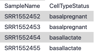
factordatafile contains basic information about the samples that we will need for the analysis. Note that the Sample IDs must match exactly with the sample names in the counts file:
Get Gene Annotations
Gene annotations can be provided to the limma-voom tool and if provided the annotation will be available in the output files. This will give us more context about the potentially interesting functions of the differentially expressed genes than a list of relatively anonymous Entrez gene IDs would otherwise give us. We’ll get gene symbols and descriptions for these genes using the Galaxy tool, which can provide annotations for human, mouse, fruitfly and zebrafish. Although, obviously in our case, we would know something is very wrong if we ended up with other organisms in our mouse data!
Hands-On: Get Gene Annotations
- Run with the following parameters:
- “File with IDs”:
countdata- “File has header”:
Yes- “Organism”:
Mouse- “ID Type”:
Entrez- Check “Output columns”:
ENTREZIDSYMBOLGENENAME- Rename file as
annodatausing the icon. The file should look similar to the (sample) of the one below:- Check the number of lines shown on the datasets in the history, there should be 27,180 lines in both. There MUST be the same number of lines (rows) in the counts and annotation.

Differential Expression with limma-voom
Filtering to remove lowly expressed genes
It is recommended to filter for lowly expressed genes when running the tool. Genes with very low counts across all samples provide little evidence for differential expression and they interfere with some of the statistical approximations that are used later in the pipeline. They also add to the multiple testing burden when estimating false discovery rates, reducing power to detect differentially expressed genes. These genes should be filtered out prior to further analysis.
There are a few ways to filter out lowly expressed genes. When there are biological replicates in each group, in this case we have a sample size of 2 in each group, we favour filtering on a minimum counts-per-million (CPM) threshold present in at least 2 samples. Two represents the smallest sample size for each group in our experiment. In this dataset, we choose to retain genes if they are expressed at a CPM above 0.5 in at least two samples. The CPM threshold selected can be compared to the raw count with the CpmPlots (see below).
The limma tool uses the cpm function from the edgeR package (Robinson et al. 2010) to generate the CPM values which can then be filtered. Note that by converting to CPMs we are normalizing for the different sequencing depths for each sample. A CPM of 0.5 is used as it corresponds to a count of 10-15 for the library sizes in this data set. If the count is any smaller, it is considered to be very low, indicating that the associated gene is not expressed in that sample. A requirement for expression in two or more libraries is used as each group contains two replicates. This ensures that a gene will be retained if it is only expressed in one group. Smaller CPM thresholds are usually appropriate for larger libraries. As a general rule, a good threshold can be chosen by identifying the CPM that corresponds to a count of 10, which in this case is about 0.5. You should filter with CPMs rather than filtering on the counts directly, as the latter does not account for differences in library sizes between samples.
Normalization for composition bias
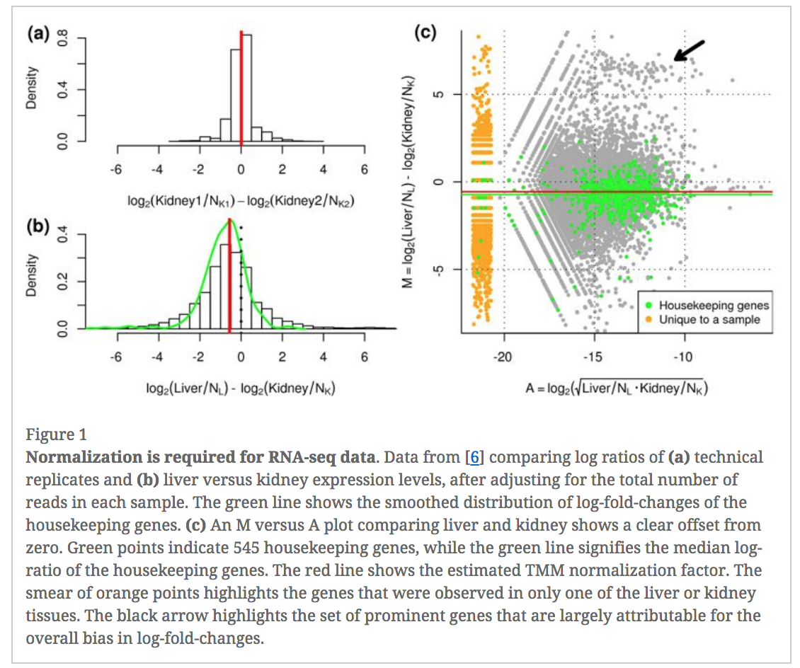
In an RNA-seq analysis, the counts are normalized for different sequencing depths between samples. Normalizing to eliminate composition biases between samples is also typically performed. Composition biases can occur, for example, if there are a few highly expressed genes dominating in some samples, leading to less reads from other genes. By default, TMM normalization (Robinson and Oshlack 2010) is performed by the limma tool using the edgeR calcNormFactors function (this can be changed under Advanced Options). TMM stands for Trimmed Mean of M values, where a weighted trimmed mean of the log expression ratios is used to scale the counts for the samples. See the figure from the TMM paper below. Note the plot (Figure 1c) that shows how a few highly expressed genes in the liver sample (where the arrow is) results in the majority of other genes in the sample having the appearance of being expressed lower in liver. The mid-line through the points is offset from the expected zero and the TMM normalization factor (red line) scales the counts to adjust for this.
Specify Contrast(s) of interest
Since we are interested in differences between groups, we need to specify which comparisons we want to test. This will become more important when we are working with more complex data sets that have multiple possible comparisons For example, in this case we are interested in knowing which genes are differentially expressed between the pregnant and lactating group in the basal cells so we will specify basalpregnant-basallactate for the Contrast of Interest. Note that the group names in the contrast must exactly match the names of the groups in the factordata file.
Hands-on: Differential expression with limma-voom
- Run the with the following parameters:
- “Differential Expression Method”:
limma-voom- “Count Files or Matrix?”:
Single Count Matrix
- “Count Matrix”: Select
countdata- “Input factor information from file?”:
Yes
- “Factor File”: Select
factordata- “Use Gene Annotations?”:
Yes
- “Factor File”: Select
annodata- “Contrast of Interest”:
basalpregnant-basallactate- “Filter lowly expressed genes?”:
Yes
- “Filter on CPM or Count values?”:
CPM- “Minimum CPM”:
0.5- “Minimum Samples”:
2- Output Options
- “Additional Plots” selected:
Density Plots (if filtering)CpmsVsCounts Plots (if filtering on cpms)Box Plots (if normalising)MDS Extra (Dims 2vs3 and 3vs4)MD Plots for individual samplesHeatmaps (top DE genes)Stripcharts (top DE genes)- “Output Library information file?”:
Yes- Inspect the
Reportproduced by clicking on the (eye) icon.
QC of count data using plots from limma
Before we check out the differentially expressed genes, we can look at the Report information to check that the data is good quality and that the samples are as we would expect.
Multidimensional scaling plot
By far, one of the most important plots we make when we analyse RNA-Seq data are MDS plots. An MDS plot is a visualisation of a principal components analysis, which determines the greatest sources of variation in the data. A principal components analysis is an example of an unsupervised analysis, where we don’t need to specify the groups. If your experiment is well controlled and has worked well, what we hope to see is that the greatest sources of variation in the data are the treatments/groups we are interested in. It is also an incredibly useful tool for quality control and checking for outliers.
This Galaxy tool outputs an MDS plot by default in the Report and a link is also provided to a PDF version (MDSPlot_CellTypeStatus.pdf). A scree plot is also produced that shows how much variation is attributed to each dimension. If there was a batch effect for example, you may see high values for additional dimensions, and you may choose to include batch as an additional factor in the differential expression analysis. The limma tool plots the first two dimensions by default (1 vs 2), however you can also plot additional dimensions 2 vs 3 and 3 vs 4 using under Output Options Additional Plots MDS Extra.
These are displayed in the Report along with a link to a PDF version (MDSPlot_extra.pdf). Selecting the Glimma Interactive Plots will generate an interactive version of the MDS plot, see the plots section of the report below. If outlier samples are detected you may decide to remove them. Alternatively, you could downweight them by choosing the option in the limma tool Apply voom with sample quality weights?. The voom sample quality weighting is described in the paper Why weight? Modelling sample and observational level variability improves power in RNA-seq analyses (Liu et al. 2015).
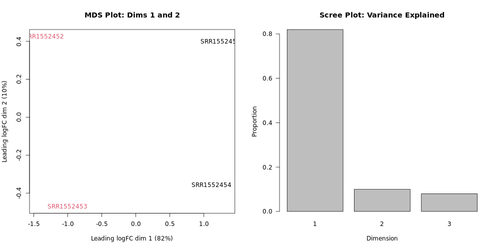
What proportion of variation can be explained by the pregnant vs. lactating condition?
Looking at the plot, we can see that the samples of the two colors (our two groups - pregnant vs. lactating), are on different sides of the MDS plot with respect to the horizontal plot axis (Dimension 1). Looking at the x-axis label, we see that this explains 82% of the variation. Looking at the
Dimension 1on the Scree Plot also confirms that about 0.8 (80%) of the variance is explained by Dimension 1.Dimensions 2 and 3 together only explain the remanining ~18% of the variation. If we had included different cell types in addition to different mouse life stages, Dimension 2 would likely correspond to the cell type variable and explain a lot more of the variation.
Next, scroll down the Report to take a look at the Additional information and Summary of experimental data sections near the bottom. It should look similar to below. Here you can check that the correct samples have been assigned to the correct groups, what settings were used (e.g. filters, normalization method) and also how many genes were filtered out due to low expression.
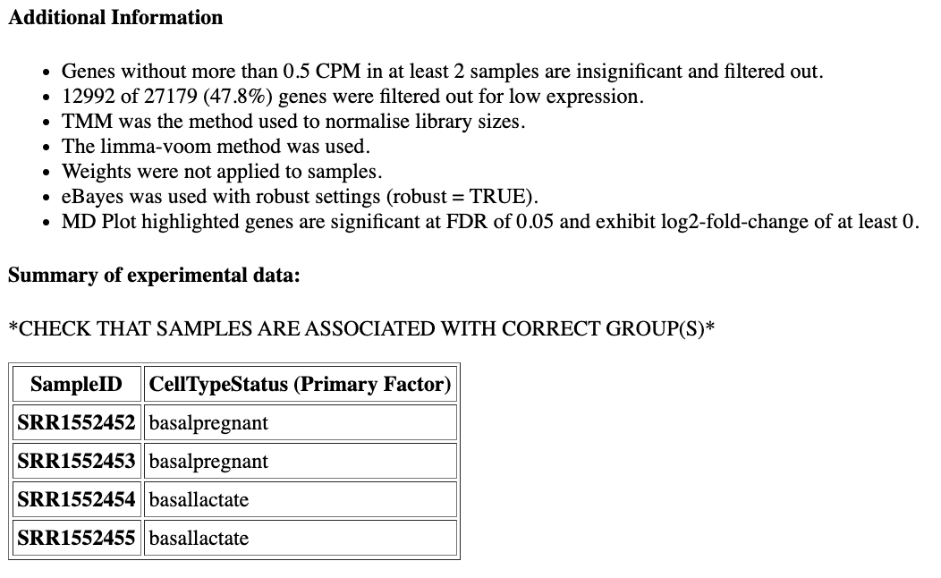
How many genes have been filtered out for low expression?
12992 (47.8%) of genes were filtered out as insignificant as they did not have CPM greater than 0.5 in at least 2 samples, as we specified when we ran the limma tool.
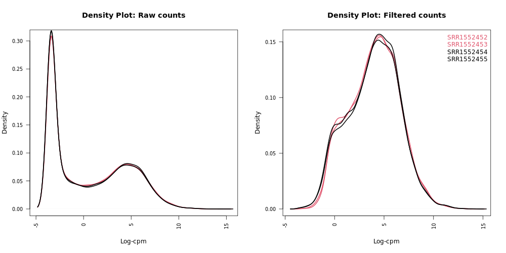
Density plots
Density plots can be output in the Report if Filter lowly expressed genes is selected. A link is also provided in the Report to a PDF version (DensityPlots.pdf). These plots allow comparison of the counts distributions before and after filtering. The samples are colored by the groups. Count data is not normally distributed, so if we want to examine the distributions of the raw counts we need to take the log values of the counts. We typically check the distribution of the read counts on the log(2) scale.
A CPM value of 1 is equivalent to a log-CPM value of 0 and the CPM we used of 0.5 is equivalent to a log-CPM of -1. It can be seen in the Raw counts (before filtering) plot below, that a large proportion of genes within each sample are not expressed or lowly-expressed, and the Filtered counts plot shows our filter of CPM of 0.5 (in at least 2 samples) removes a lot of these uninformative genes:
We can also have a look more closely to see whether our threshold of 0.5 CPM does indeed correspond to a count of about 10-15 reads in each sample with the plots of CPM versus raw counts. Click on the CpmPlots.pdf link in the Report. You should see 4 plots, one for each sample. Two of the plots are shown below. From these plots we can see that 0.5 CPM is equivalent to ~10 counts in each of the 4 samples (where the lines intersect), so 0.5 seems to be an appropriate threshold for this dataset (these samples all have sequencing depth of 20-30 million, see the Library information file below, so a CPM value of 0.5 would be ~10 counts):

Box plots
We can also use box plots to check the distributions of counts in the samples. Box plots can be selected to be output by the Galaxy if normalization is applied (TMM is applied by default). The plots are output in the Report and a link is also provided to a PDF version (BoxPlots.pdf). The samples are coloured by the groups. With the box plots for these samples we can see that overall the distributions are not identical but still not very different. If a sample is really far above or below the blue horizontal line we may need to investigate that sample further.
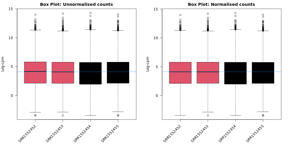
Do you notice any differences before and after TMM normalization?
It is pretty subtle, but after the normalization more of the samples are closer to the median horizontal line.
Normalization Factors
The TMM normalization generates normalization factors, where the product of these factors and the library sizes defines the effective library size. TMM normalization (and most scaling normalization methods) scale relative to one sample. A normalization factor below one indicates that the library size will be scaled down, as there is more suppression (i.e., composition bias) in that library relative to the other libraries. This is also equivalent to scaling the counts upwards in that sample. Conversely, a factor above one scales up the library size and is equivalent to downscaling the counts.

Which sample has the largest normalization factor?
Sample
SRR1552452one of thebasalpregnantsamples, has the highest normalization factor (approx. 1.02). This >1 value suggests that means that the library size had to be scaled up to become normalized.
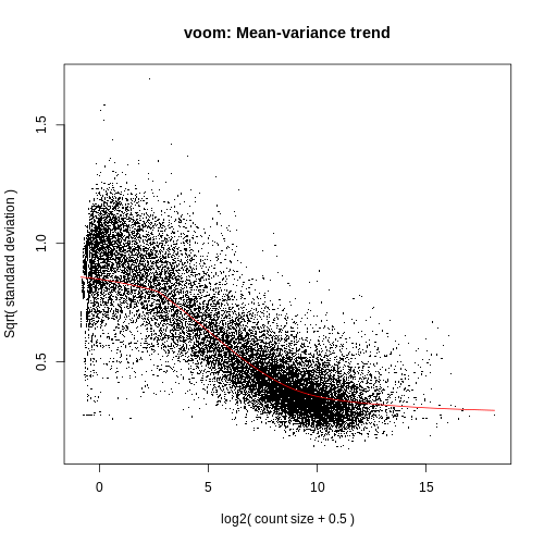
Voom variance plot
This plot (left, below) is generated by the limma-voom method and displayed in the Report along with a link to a PDF version (VoomPlot.pdf). Each dot represents a gene and it shows the mean-variance relationship of the genes in the dataset. This plot can help show if low counts have been filtered adequately and if there is a lot of variation in the data, as shown in the More details on Voom variance plots box below.
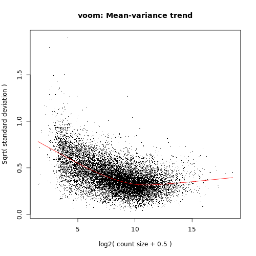
If we didn’t filter this dataset for the lowly expressed genes the variance plot would look more like below:
More examples of the variation this plot can show can be seen in Figure 1 from the limma-voom paper (Law et al. 2014), shown below.
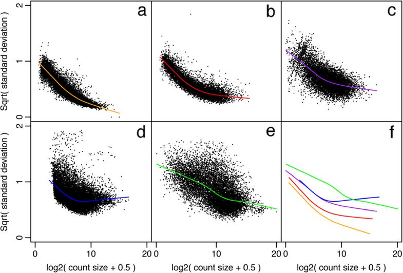
Figure 1: Mean-variance relationships. Gene-wise means and variances of RNA-seq data are represented by black points with a LOWESS trend. Plots are ordered by increasing levels of biological variation in datasets. (a) voom trend for HBRR and UHRR genes for Samples A, B, C and D of the SEQC project; technical variation only. (b) C57BL/6J and DBA mouse experiment; low-level biological variation. (c) Simulation study in the presence of 100 upregulating genes and 100 downregulating genes; moderate-level biological variation. (d) Nigerian lymphoblastoid cell lines; high-level biological variation. (e) Drosophila melanogaster embryonic developmental stages; very high biological variation due to systematic differences between samples. (f) LOWESS voom trends for datasets (a)–(e). HBRR, Ambion’s Human Brain Reference RNA; LOWESS, locally weighted regression; UHRR, Stratagene’s Universal Human Reference RNA.
Looking at the actual Differential Expression Results
Volcano Plots for Differential Expression
Genome-wide plots that are useful for checking differentially expressed (DE) results are MD plots (or MA plots) and Volcano plots. There are functions in limma for generating these plots and they are used by this tool. These plots are output by default and shown in the Report along with a link to PDF versions (MDPlot_basalpregnant-basallactate.pdf and VolcanoPlot_basalpregnant-basallactate.pdf). In the volcano plot the top genes (by adjusted p-value) are highlighted. The number of top genes that are actually labeled is 10 by default and the user can specify the number of top genes to view (up to 100) under Advanced Options.
Volcano plots are commonly used to display the results of RNA-seq or other -omics experiments. A volcano plot is a type of scatterplot that shows statistical significance (P value) versus magnitude of change (fold change). It enables quick visual identification of genes with large fold changes that are also statistically significant. These may be the most biologically significant genes. In a volcano plot, the most upregulated genes (more highly expressed in the first condition listed in the comparison i.e. basalpregnant) are towards the right, the most downregulated genes (i.e. less highly expressed in basalpregnant) are towards the left, and the most statistically significant genes are towards the top. We will talk more about creating and customizing volcano plots next week.
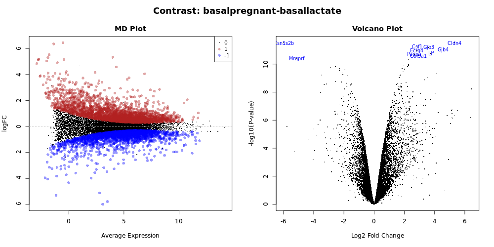
What does this tell us about the gene Cldn4?
Glancing at this volcano plot we can find the
Cldn4gene in the top right corner. This tells us (at least) two things:
- Right-hand side of plot: This is an upregulated gene (more expressed in the
basalpregnantsamples). Looking at the x-axis, this is about a 6-fold difference.- Top of plot: Because this gene is near the top of the plot, we can infer that it this is a very signifant difference.
- Taking all of this combined, we can infer that
Cldn4is our significantly upregulated gene in this particular comparison.
What does Cldn4 do?
- Just like we did with the Entrez Gene IDs, we can look up the
Cldn4gene ID on NCBI, and see that this stands forClaudin 4.- Click the claudin 4 Mus musculus link in the results table, so that we can see results specifically in mice.
- In the summary, we can see that “Claudins are integral membrane proteins and components of tight junction strands”.
- Do you think this makes biological sense given our comparison?
limma-voom tabular output
Although the tool produces a lot of really helpful diagnostic plots if we tell it to, the core output of this tool is a tabular file of differentially expressed genes. This tabular format can allow us to filter the data in different ways and is very useful input for further downstream tools for visualization and analysis.
To access this file, click on the limma on data...:DE tables object in your history. Then, click on the object called limma-voom_basalpregnant-basallactate. You should have an output file that looks like below (only first lines shown for brevity):
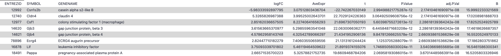
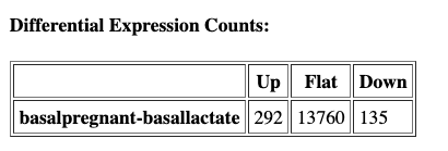
This output table should have the same number of data-containing rows as the total of the Differential Expression Counts table in the HTML report:

The columns of the limma-voom table can be interpreted as below:
| Limma-voom output column | Explanation |
| ENTREZID | NCBI Entrez ID for this differentially expressed gene |
| SYMBOL | Abbreviated gene name |
| GENENAME | Full gene name |
| logFC | log(2) fold change between the two experimental conditions (basalpregnant vs. basallactate) |
| AveExpr | Average log(2)fold change across all samples in comparison |
| t | moderated t-statistic: t-statistic like those for a normal t-test, adjusted for aspects of the experiment |
| P.value | P-value associated with the above t-statistic |
| adj.P.value | p-value adjusted for multiple testing |
| B | B-statistic is the log-odds that the gene is differentially expressed. For reference, a B-statistic of 0 corresponds to a 50-50 chance that the gene is differentially expressed. |
How is this tabular output sorted by default?
Scanning across the columns, we can see that the table appears to be by default sorted by the
adj.P.valuecolumn. This means that the most significantly differentially expressed genes (after correcting for multing testing, see below) are at the top of the table.
A note about deciding how many genes are significant
In order to decide which genes are differentially expressed, we usually take a cut-off (e.g. 0.05 or 0.01) on the adjusted p-value, NOT the raw p-value. This is because we are testing many thousands of genes in our experiment, and the chances of finding differentially expressed genes is very high when you do that many tests. Hence we need to control the false discovery rate, which is the adjusted p-value column in the results table. What this means is that, if we choose an adjusted p-value cut-off of 0.05, and if 100 genes are significant at a 5% false discovery rate, we are willing to accept that 5 will be false positives.
Testing relative to a threshhold (TREAT)
When you have a huge list of differentially expressed genes, sometimes we may want to set cut-offs so we can follow up on the most biologically relevant genes.However, it is not recommended to simply rank by p-value as this has been shown to increase the false discovery rate (i.e. a rate of . In other words, you are not controlling the false discovery rate at 5% any more. There is a function called treat in limma that performs this style of analysis correctly (McCarthy et al. 2009).
TREAT will simply take a user-specified log-fold change cut-off and recalculate modified t-statistics and p-values with the new information about logFC. There are thousands of genes differentially expressed in this basalpregnant-basallactate comparison, so let’s rerun the analysis applying TREAT and similar thresholds to what was used in the Fu paper: an adjusted P value of 0.01 (1% false discovery rate) and a log-fold-change cutoff of 0.58 (equivalent to a fold change of 1.5).
Hands-on: Testing relative to a threshold (TREAT)
- Use the Rerun button on one of the limma output objects in the History to rerun with the following parameters modified. Leave all the other options the same as when we ran the tool before:
- “Advanced Options”
- “Minimum Log2 Fold Change”:
0.58- “P-Value Adjusted Threshold”:
0.01- “Test significance relative to a fold-change threshold (TREAT)”:
Yes- Add a tag
#treatto theReportoutput and inspect the report.
We can see that many fewer genes are now highlighted in the volcano plot and identified as differentially expressed now that we have applied more stringent conditions for something to be considered differetially expressed:

Visualizing differential expression results to identify interesting genes
In addition to the plots already discussed, it is recommended to have a look at the expression levels of the individual samples for the genes of interest, before following up on the DE genes with further lab work. The Galaxy limma tool can auto-generate heatmaps of the top genes to show the expression levels across the samples. This enables a quick view of the expression of the top differentially expressed genes and can help show if expression is consistent amongst replicates in the groups. The following results are all after the TREAT step was applied:
Heatmap of top genes
Click on the Heatmap_basalpregnant-basallactate.pdf link in the Report. You should see a plot like below. Each horizontal row corresponds to a gene (labeled on the right), while each column refers to a sample. Genes that are relatively upregulated for a sample are shown in red, while those relatively downregulated in a given sample are in blue.

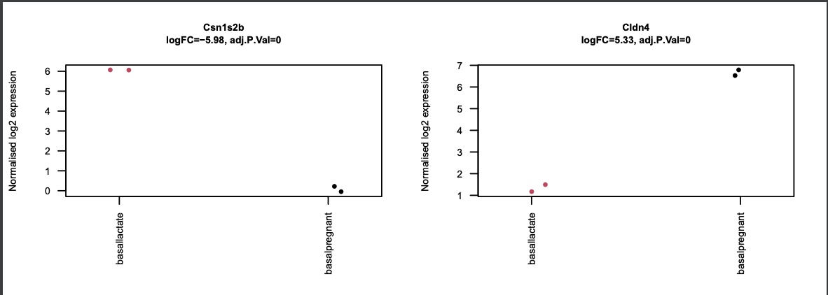
What genes are comparatively downregulated in sample
SRR1552452?Looking at the column labeled
SRR1552452we see that there are two genes that are in blue, meaning they have a negative Z-score, meaning that they are comparatively downregulated in thisbasalpregnantsample. The gene labels tell us that these are genesCsn1s2bandMrgprf. You could optionally use this info to look up more about the function of these genes on NCBI. Note: Of course, this plot is only showing us the Top 10 most DE genes - there are likely many other comparatively downregulated genes for this sample.
Stripcharts of top genes
The limma-voom tool can also auto-generate stripcharts to view the expression of the top genes across the groups. Click on the Stripcharts_basalpregnant-basallactate.pdf link in the Report. You should see 10 plots, one for each top gene. Two are shown below. Note that here you can see if replicates tend to group together and how the expression compares to the other groups.
What other plot gives us information about replicates clustering?
Scrolling back through the all of the QC plots, look for another plot that represents the samples spatially. Perhaps your eye is drawn towards the
MDS Plots, which, as a reminder, are visualisations of a principal components analysis, which determines the greatest sources of variation in the data. So, the MDS plots are an overall picture of how the samples are separated based on the expression of all of the genes, and are helpful for troubleshooting. In contrast, the strip charts show how samples separate based just on the expression of a single gene. The separation betweenbasalpregnantandbasallactatewould be much less visually apparent if we were to make a stripchart for say, the 2000th most differentally expressed gene as opposed to those in the Top 10. If your experiment is well controlled and has worked well, what we hope to see is that the greatest sources of variation in the data are the treatments/groups we are interested in.
Conclusion
In this tutorial we have seen how counts files can be converted into differentially expressed genes with limma-voom. This follows on from the accompanying tutorial, RNA-seq reads to counts, that showed how to generate counts from the raw reads (FASTQs) for this dataset. In this part we have seen ways to visualise the count data, and QC checks that can be performed to help assess the quality and results. We have also reproduced results similar to what the authors found in the original paper with this dataset.
Preview of next week:
There are probably a couple things that you are left wondering or wish to improve, though:
- Can I make prettier, customized versions of some of these figures?
- Can we make inferences about whole functional categories of genes and their expression?
- Can some of this be done in a more automated way?
Don’t worry - the answer to these questions is YES and we will be addressing them next week!
Key Points
The limma-voom tool can be used to perform differential expression and output useful plots
Multiple comparisons can be input and compared
Results can be interactively explored with limma-voom via Glimma